A Dash of Entertainment in Education
In this post, we will talk about how the educators are taking a page out of films production studies, and why it’s a good thing
I ran into Webflow tutorial and noticed that it is way better than most tutorials, so as promised here is my analysis.
We see that most tutorials are direct and pretty boring but they get the job done.
Few online educators are focused more on pure content1, and the material, they don’t really pay attention to how it’s presented2
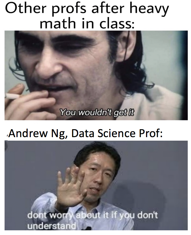
If we look at educators admired by Internet, David J Malon, and Andrew Ng comes to mind. On close observation we see that along with good material, they focus on keeping students engaged, try to keep it casual and entertaining by sharing relevant insights, and that changes the mood and turns the dreadful lecture into more engaging and enjoyable.
As a result, we see that students love these classes, and it can be seen in online communities, In ML community Andrew Ng memes are a thing 🙂
We see this new trend where educators are combining education and entertainment to engage users, but this is a tight rope because overdoing can feel forced and will lose the humor and then goes on the cringe side.
Webflow is using these techniques and looks like it’s working because it had me engaged. I watched multiple Webflow tutorials, and they are well designed, engaging, and hits the nice balance of education and entertainment
See this short tutorial on “Introducing scheduled publishing for Webflow CMS items” to better understand what I am talking about.
Anatomy of a Webflow tutorial
- Set expectation of viewers by stating what the tutorial will teach, shows steps
- Shows the parts/subparts, and reads them out loud to enforce it (add effect, don’t just read it out)
- After each step, shows that the next step is happening by saying that step out loud and also showing it on screen
- End with a punchline
This structure is good because it respects users, and provides good user experience3
- It sets the expectation at the start, and it allows you can click away if you landed on the wrong tutorial.
- Each step is clearly marked with visual and auditory indicators to ensure that users are aware of where they are
- A dash of humor that acts like glue in those otherwise dry steps
Other Observations
- Good writing is the key here, these tutorials are written like company sketch/ movies with focus on teaching and engagement
- Music and sound design is another important thing4 that is done well
- No boring ukulele song, there are proper sound effects with good background music
- Edits are done well, they incorporate visual gags, and have focus/zoom and other effects to keep it interesting
- Tutorial opens up with the logo and sets the expectation, and then get to the point with few subtle gags to keep it interesting, and then end with a call to action of a punchline, and final screen is linked with a short call to action.
Closing Note:
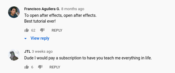
Maybe, I over-analyzed the things but I seem to enjoy this new trend, and looks like others are liking it too, these are YouTube comments from one of Webflow video
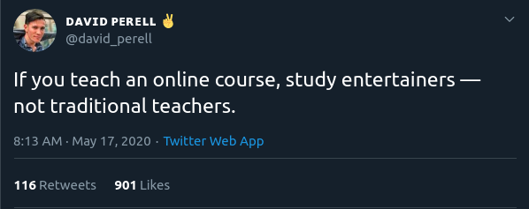
In this thread, David Perell goes on more details, recommended reading 🙂
Update: Looks Netlify has entered the chat, see this and this tweet
That’s all, Stay In and Stay Safe 👋
footnotes:
-
they are still great and valuable, and I understand that not everyone has the budget for all the fancy things ↩
-
It depends on the nature of material and subject as well ↩
-
Videos have two dimensions of UX because they are experienced with eyes and ears, so if they are designed with both eyes and ears in mind, I consider it good UX ↩
-
Sound design can make and break a movie, and the same is true here ↩